
PEERLESS FAUCET
THE CHALLENGE.
When it first limped through our door, the Peerless Faucet brand was dated and uninspiring. Peerless was a paradox—sacred to some, but completely unknown to others.
Our charge was to make a 40-year-old brand relevant to a new generation of customers, without alienating the existing base. As added pressure, the rebrand would need careful, coordinated rollout on an international stage.
That’s a recipe for a challenging rebrand.

The Solution.
Agencies tend to “throw the baby out with the bathwater,” scrapping every remnant of the old brand—even if it worked. For us, step one was avoiding that temptation. Brand equity is a precious commodity, so we looked for every opportunity to salvage what was working, while carefully folding new energy into the brand.
After listening to consumers, trade professionals, and retailers, we realized that the Peerless logo—while dated and in sore need of an update—had earned the trust of much of the target audience. So, instead of scrapping it, we renovated it. The DNA of the original Peerless logo is clearly visible in the new mark.
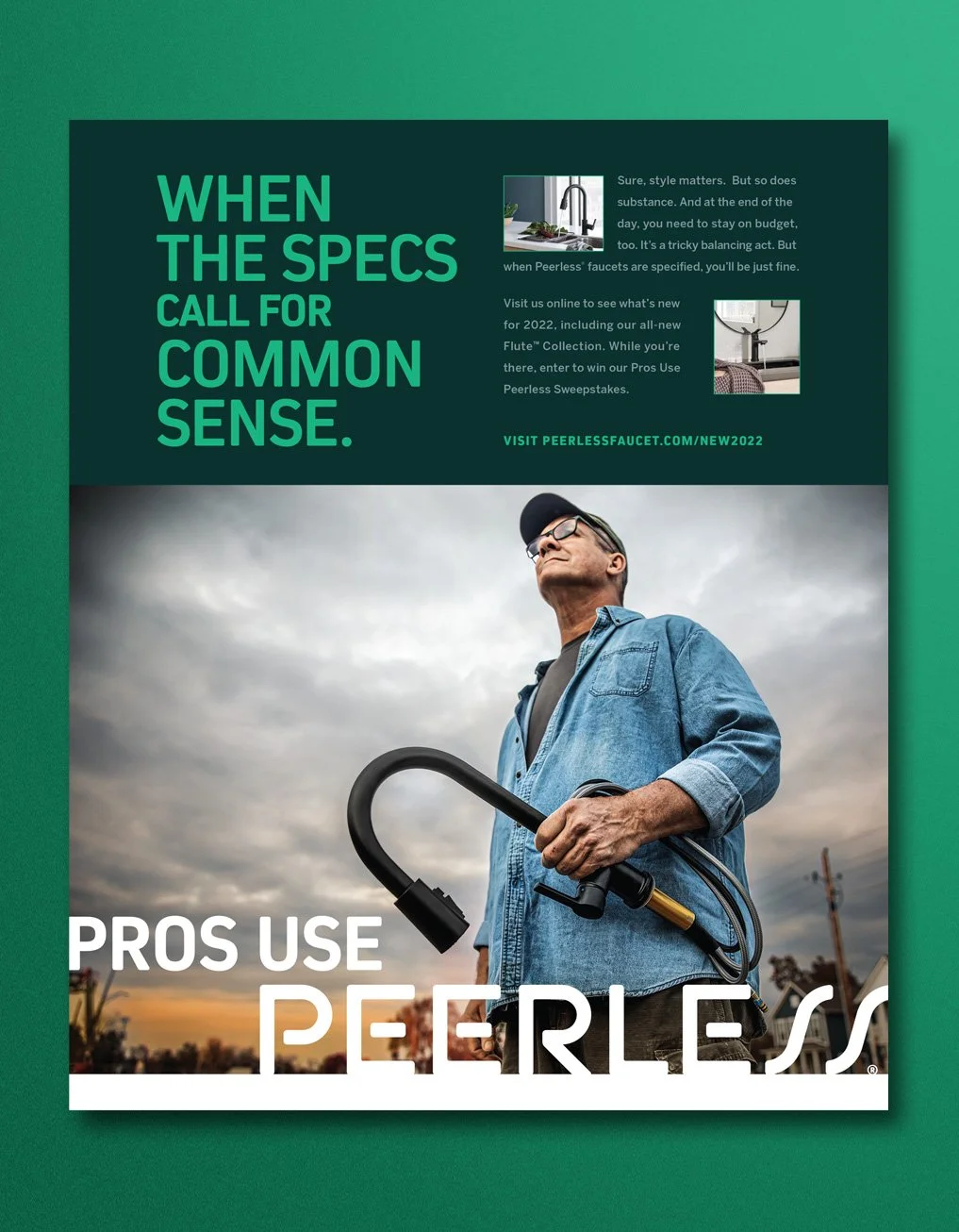
Next, we applied the same sensibility to packaging, social media, in-store displays, traditional advertising, and all the myriad nooks and crannies you’d expect in a global rebrand. The message was always clear and simple: Peerless products look fantastic but don’t cost a ton.
The Results.
Simply put, we saved the base while attracting new customers.
In an ultra-competitive marketplace, Peerless’ multifamily channel business is up more than 25%. Awareness among all consumers is up two points. And, interestingly, business among existing customers is better than ever; trade show leads and sales are now twice as strong as they were prior to rebranding.
The Deliverables.
Brand Development/Positioning
Marketing Strategy
Logo Design
Visual Brand Identity
Packaging
Social Media
Videos
Paid Media (Digital, Print)
Retail Displays
Trade Show Strategy and Display
Catalogs
Literature
Wearables
